ISEP Energy Chart is an energy data visualization project conducted by ISEP. Interpret the rapid development of renewable energies through data analysis.
In leading countries such as Germany and Denmark, energy generation data is released in a timely manner, then visualised by government and private entities to be used in research and policy proposals.
Thanks to this shared data, scientific analyses from many different perspectives are conducted, which has contributed to the progress of the conversion to renewable energies.
Germany
- SMARD by German Federal Network Agency
- Energy Charts by Fraunhofer Institute for Solar Energy Systems (ISE)
- Agorameter by Agora Energiewende
Denmark
In Japan, until recently specific data has been kept private, however along with the power system reform, since April 2016, the supply and demand data every hour from each of the 10 power provision regions has been made open to the public. Using this data, with cooperation from the journalist Murakami Atsushi, WELLNEST HOME Co., Ltd. has been visualizing the electricity supply and demand data.
(Visualization of electricity demand and supply in Japan)
We at ISEP have used the public data for many activities including create graphs, conduct analyses, form policy recommendations and in the production of the “Renewable Japan Status Report”. Additionally, we started to compile data on energy supply and demand, and believing that there is a need to publicize/release the expertise and graphs we have accumulated in an accessible form for more people to use, we have created the ISEP Energy Chart webite to visualise the energy generation data.
As renewable electricity has been gathering more attention, data on renewable heat usage seems to be lacking, as it is not being maintained.
Through these series events, we were considering a new energy data visualisation website since August 2017, and released the following data visualisations in February 2018.
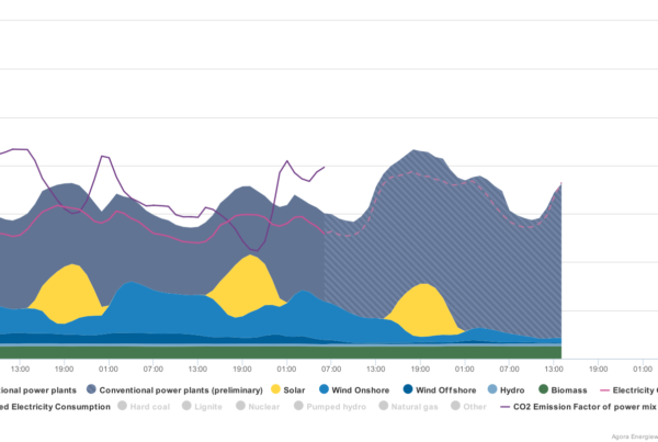
- Electricity Generation and demand – Displays the electricity demand and generation from different sources against a particular time frame.
- RE shares in electricity demand or production – Displays pie charts of the distribution of electricity generation for a specified region and time period.
- Cumulative Installed Capacity – View bar graphs of the annual culumative generation capacity of installed renewable energy facilities.
- Data Search -View the maximum and minimum renewable energy generation records for a specified region and time period.
- Blog – Articles providing explanations for graphs of noteworthy data and recent events.
We are considering the visualisation of data such as:
- Visualization of usage of interconnection
- Visualization of renewable heat use
- English translation of the website
We are working hard to expand this website while/as we receive your thoughts and comments.
Donations
The ISEP Energy Chart can be said to be one of the pillars of our “energy democracy” vision. We are providing this service free of charge so that we can create a society in which anybody can access energy information.
License
This ISEP Energy Chart is provided under the Creative Commons Attribution-ShareAlike 4.0 International License.
Secondary use for commercial purposes is also permitted provided proper credit is given to the original creator, and the product is released under the same CC license. In other words, downloaded graphs can be freely used for educational, research and business purposes given that credit is provided to ISEP. Should an graph be modified, it must be recognized to have been modified by a third party.
Credit Sample
Source: Institute for Sustainable Energy Policies (2018) ISEP Energy Chart “Electricity generation and demand” Nationwide April 1 to 7, 2017 Data.