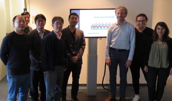
This blog article is the second part on our information exchange with Agora Energiewende. It focuses on the impressive and important aspects of the Agorameter. As I mentioned before, Agora Energiewende was one of the websites, which inspired the ISEP Energy Chart.
Besides the Agorameter, there are other sites which provide visualizations of the electricity supply and demand in Germany, namely the Fraunhofer Institute for Solar Energy Systems and the SMARD platform by the German Federal Network Agency
The Agorameter was established in 2013 and the Fraunhofer Energy Chart website started in 2014. 1) The SMARD platform was established in 2017 after the former director of Agora Energiewende Rainer Baake became the secretary of state in the Federal Ministry for Economic Affairs and Energy in 2014 and advanced the idea of an energy chart provided by the German Federal Network Agency.
After the SMARD platform with similar energy charts was introduced, Agora Energiewende had to consider if they should continue to provide the Agorameter or focus on new tasks. In the end, the team decided to continue the Agorameter, since they had some important and unique features.
We wish to see such a healthy competition in Japan as well.
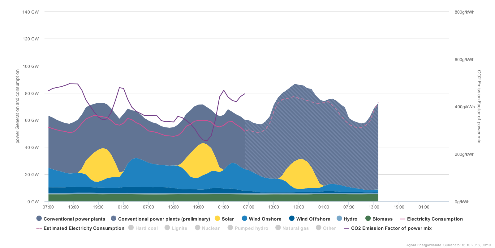
It was encouraging to hear that the Agorameter turned out to be Agora Energiewende’s main ‘magnet’ for visitors to their homepage. Since in Germany real-time data on the energy production is available, people who wonder “How does today’s weather translate into renewable energy production” can easily find the answer by checking the Agorameter.
The Agorameter receives their real-time data from several sources. However, the data quality is never sufficient and sometimes data is missing. For example, data from some conventional power plants was missing on the day of our visit. In a case like this, Agorameter displays the mistakes in the databases openly to increase the transparency of their information and to show the users how robust their data in the given moment is.
Typical Agorameter users are not only students and researchers, but also the broader public.
The Agorameter is working on a new feature, which answers the question “How could today’s power supply and demand look like in 15 years” with the assumption that the energy transition in Germany will proceed as planned.
The team of the Agorameter puts a lot of emphasis on creating simple to understand graphs and easy to grasp stories within these graphs. The aim is to inform the people about the current state of the energy transition and stimulate fact-based discussions.
The next blog article will be about the advices by Agora Energiewende on the ISEP Energy Chart.
1) The Fraunhofer Institute provided weekly energy charts already long before they started their interactive energy chart website.